Ireno. Peace in. Peace out.
There are plenty of stories about conflicts between craftsmen and homeowners. But can peace survive a renovation project?
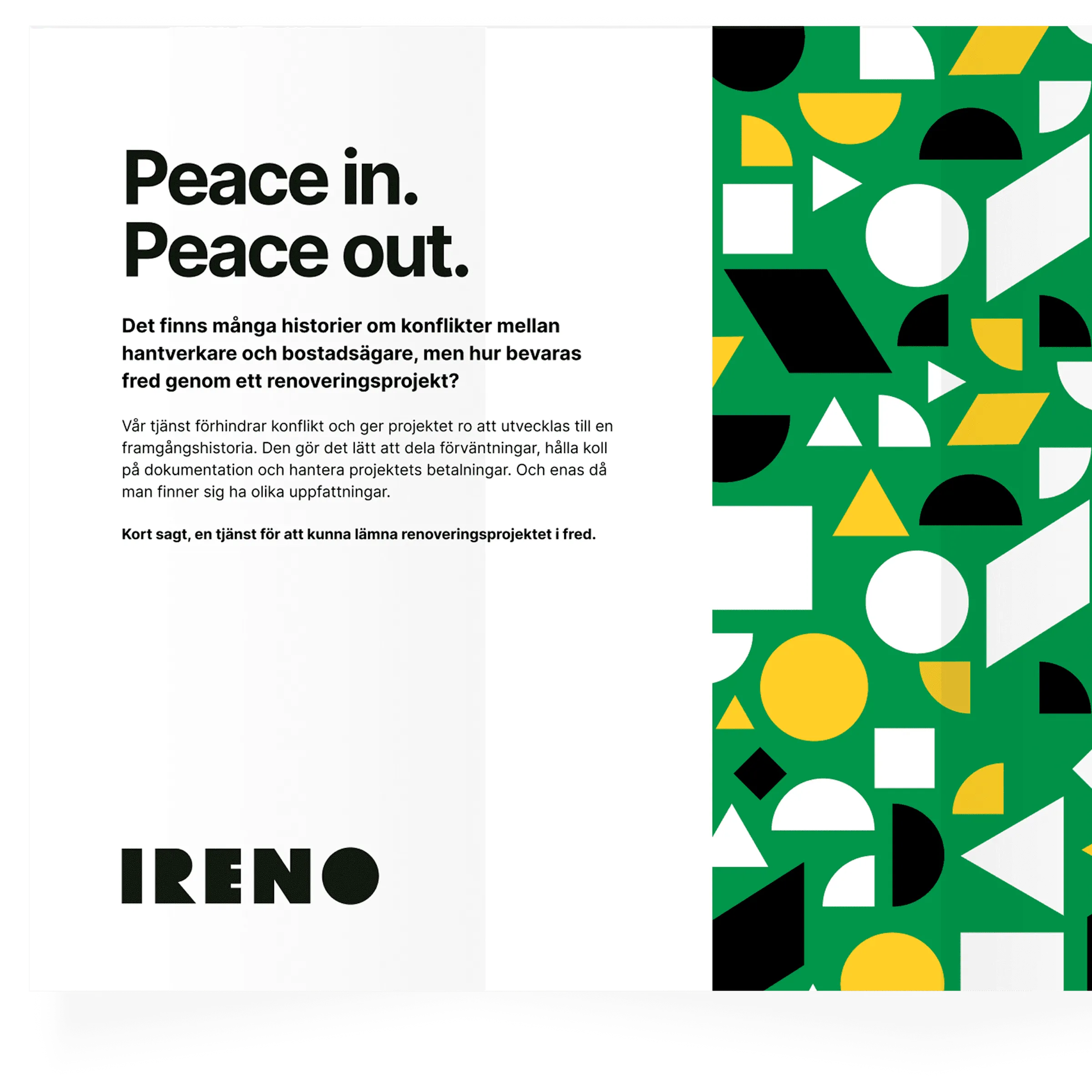
Ireno is a service that prevents conflict and gives the project the peace it needs to become a success story. It makes it easy to share expectations, keep track of documentation and manage project payments. Ireno also acts as an intermediary when you find yourselves seeing things differently.
In short: Peace in. Peace out.
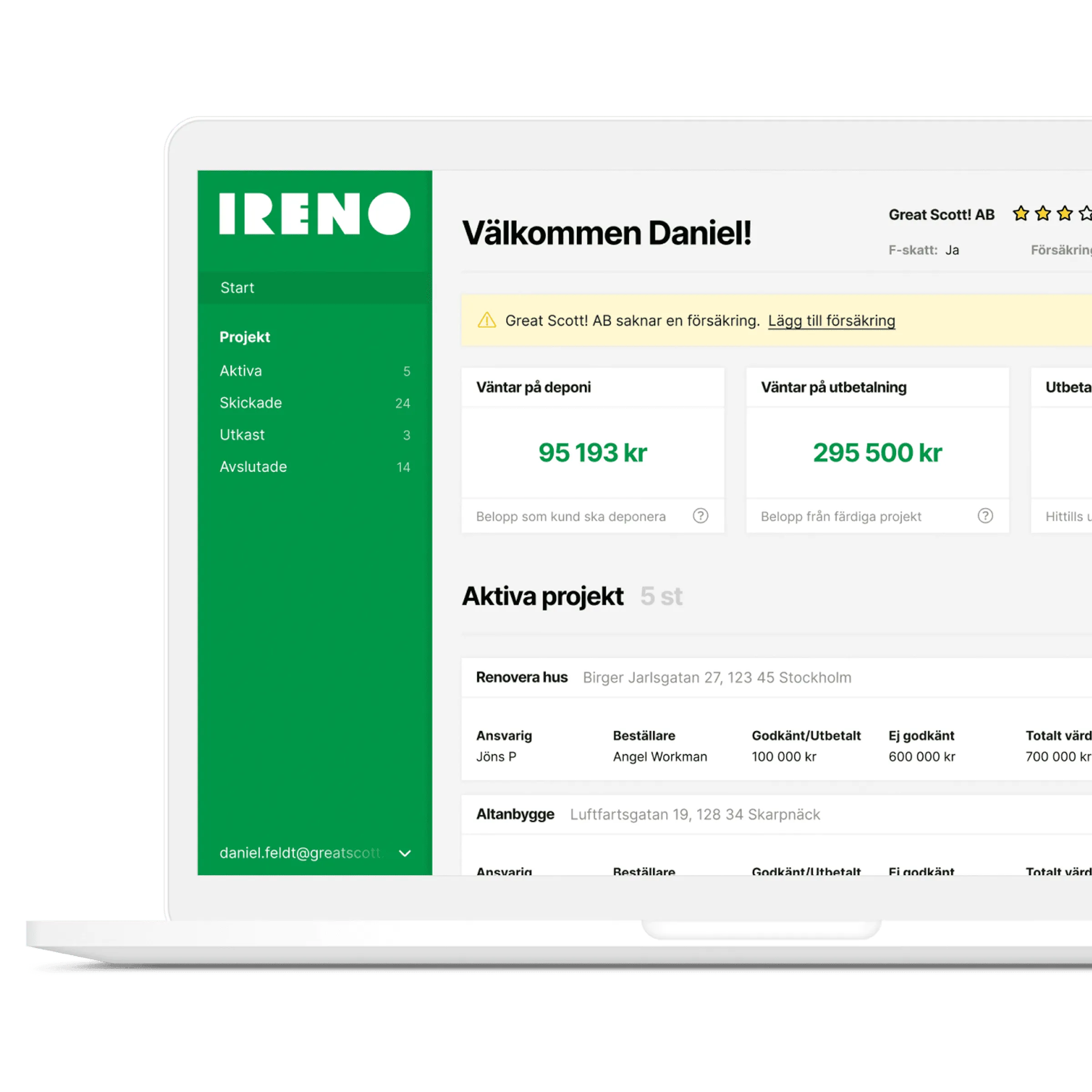
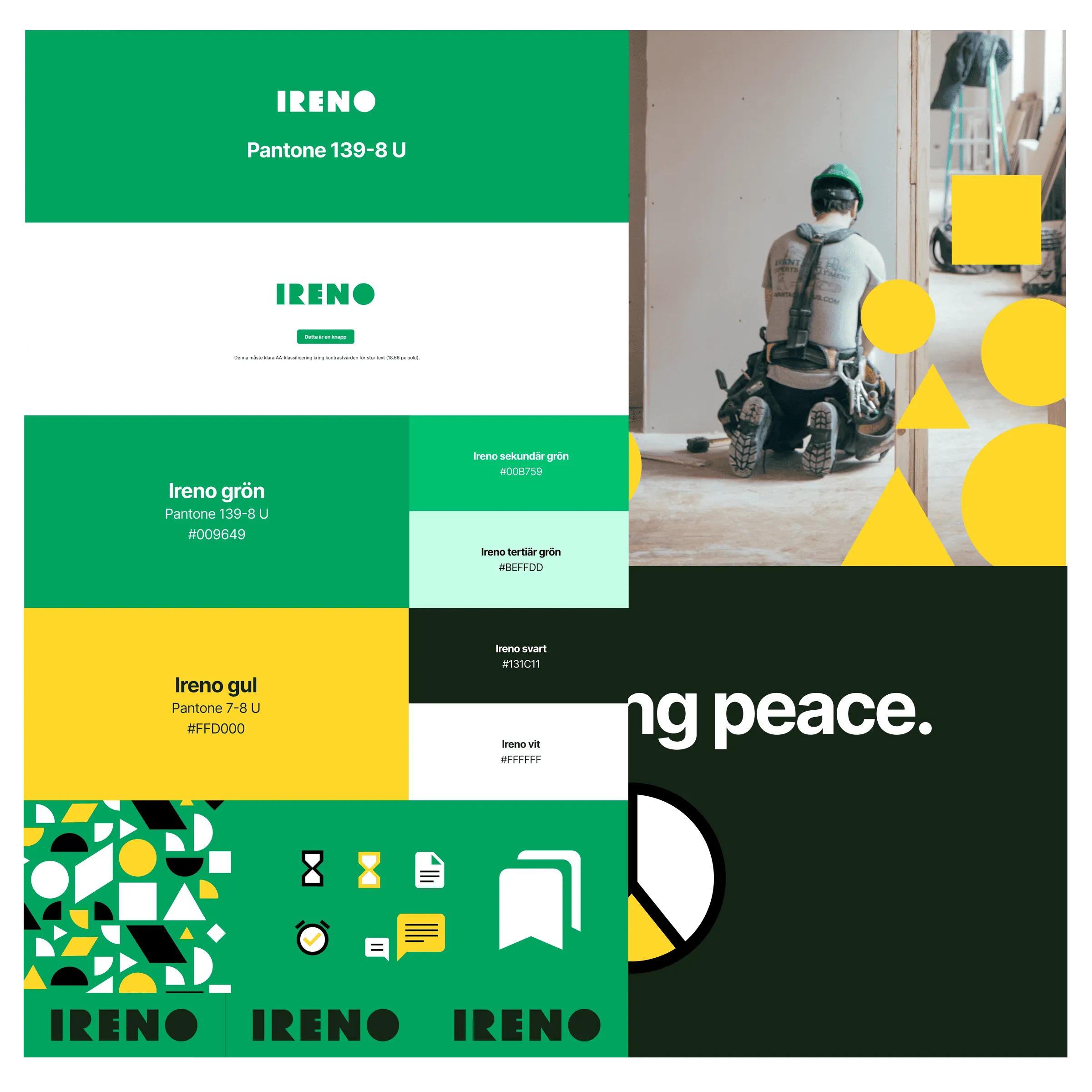
I did the branding and the UI/UX for their back-office tool, which keeps track of clients, projects, documentation and all the contracts and insurances that come with a project.
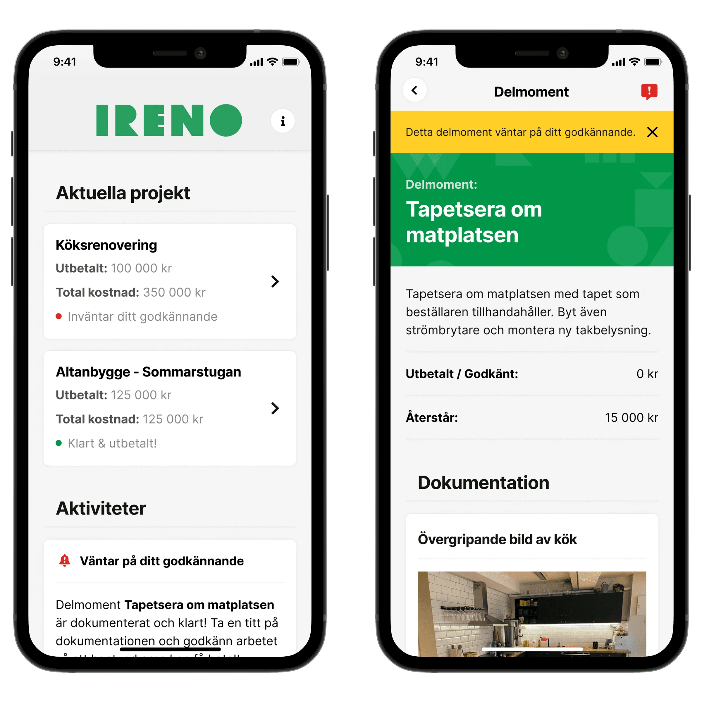
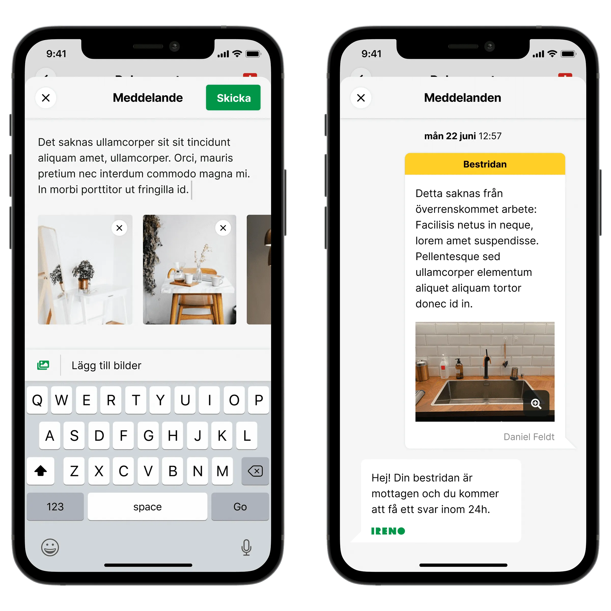
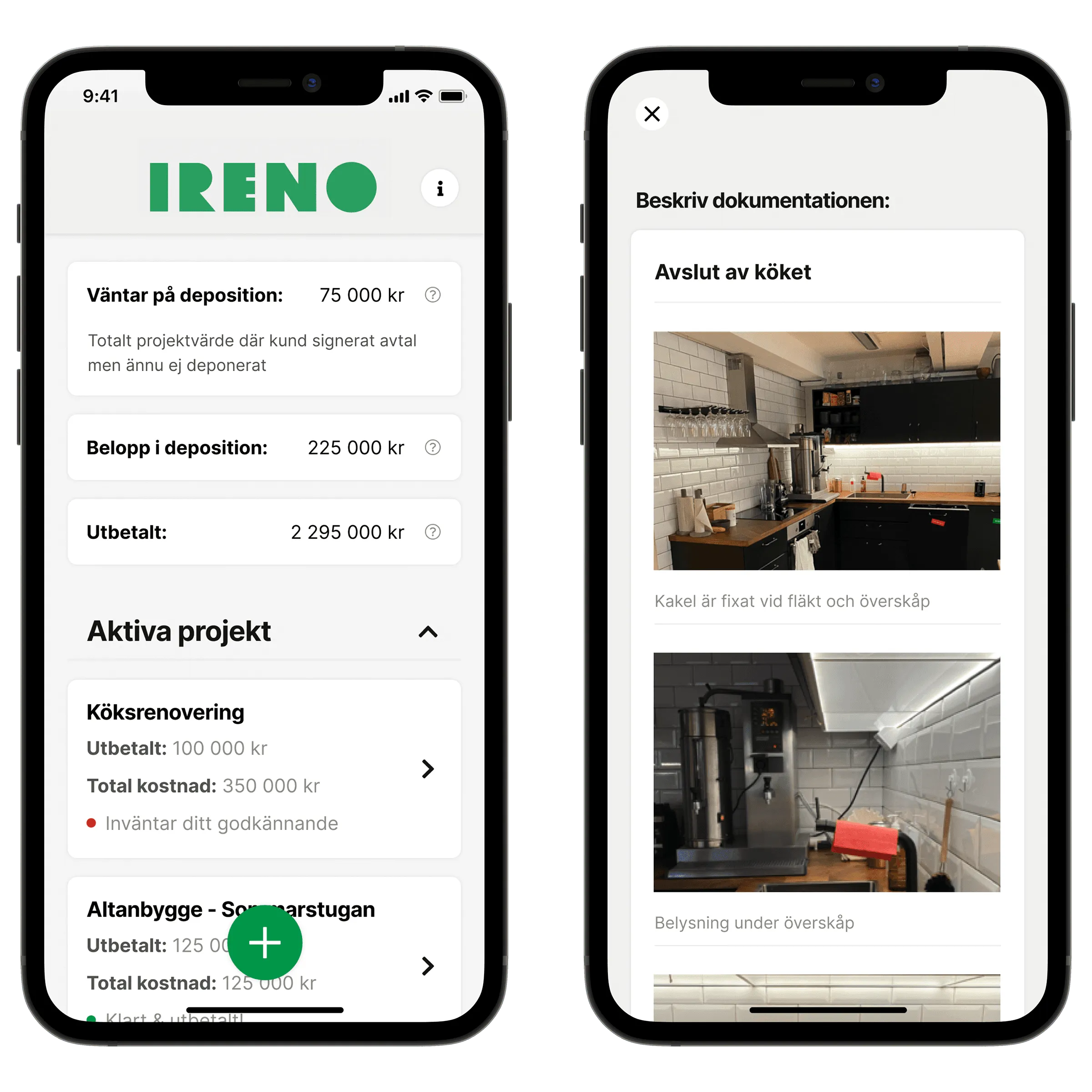
I also designed the UI & UX for the companion apps, one for homeowners and one for craftsmen.
- End product
- UI/UX & Brand work
- Platform
- Web, iOS & Android
- Technology
- Web & native apps
- Year
- 2021
- Visit
- ireno.se ↗
 All work20 projects since 2018, more on the way